Our entire project management was based on the Scrum framework. To be as flexible and organized as possible, we structured the project into bi-weekly sprints.
Before each sprint we did extensive sprint planning, guessing story points that reflect the complexity of each user story and defining what we want to get done within the sprint.
If needed, we ended the sprint with a retrospective. Our process also included technical and functional reviews.
Design
Research, User Interviews & User Testing
Since none of our team members initially knew what balancing group management is, we invested a small amount of time in researching the topic to understand what the regular tasks of a balancing group manager are.
Our first goal was to keep the project as close to the user’s needs as possible. Then we prepared a user interview, to get a sense of our users needs.
Through Exxeta we were able to do the user interview with a balancing group manager. his helped us to identify which features would be important to have in a minimum viable product that could support a full basic user workflow.
During the evaluation of the user interview we clustered the results and extracted different features out of the information we gathered.
These were then encapsulated into user stories which were the foundation of our sprints.
Screenshot of our Miro Board - Clustered Interview Notes and Result
At the end of our development phase, we conducted a final user test to evaluate our prototype. For this, we prepared a complete user flow through the application. The interviewee then was prompted small tasks that would require her/him to go through that user flow.
During the execution of those tasks we took notes on what went well and what problems the interviewee had to face when using the application.
We also paid close attention to feature and improvement suggestions that the interviewee made.
As well as for the first interview, we again clustered all the notes and extracted future user stories for our application.
Screenshot of our Miro Board - Guideline, Clustered User Test Notes and Result
Our Design Process
The design process was straightforward as Katharina and Nhu already have experience. ith the help of Figma, both could easily work on different designs in parallel first. Afterwards, they came together and discussed their ideas, the advantages and disadvantages of the designs. After each bi-weekly sprint, the design decisions were presented to the whole team. We’ve had the opportunity to work with Daniel Heusohn, a UX-Designer from Exxeta, from whom we received valuable feedback.
The overall design process was as follows:
Collect best practices and inspiration based on the user interview/test findings
Create a low-fidelity prototype
Define the color scheme and typography
Create a high-fidelity prototype
Create developer handoff page
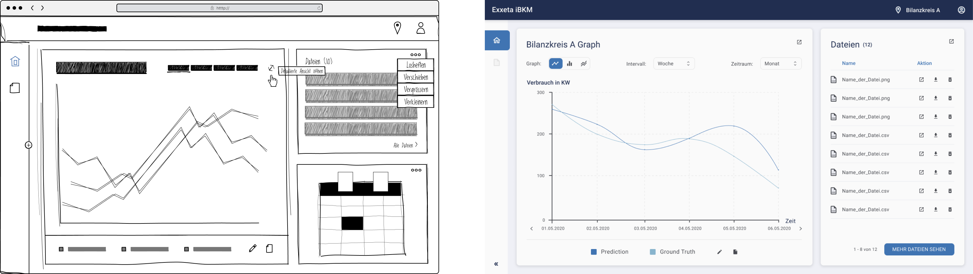
Starting with collecting design inspiration and best practices and utilizing the well-prepared user stories as a guideline, Katharina and Nhu then jumped into creating a low-fidelity prototype. A simple hand-drawn wireframe UI kit has been used, which consists of a minimum of needed elements to create anything one could have had imagined. They played with different variations of screen designs to weigh up which compositions might be the best fit, resulting in ten promising screens, which made it to the final cut.
Following the wireframes, they created a high-fidelity prototype. Parts of the Pegasus Design System and Material Icons have been used, their clean and fresh design. Something worth emphasizing the various form elements and buttons, which were designed from scratch to fit our color scheme and look.
Snippet of our Figma Project - Components (Form Elements and Buttons)
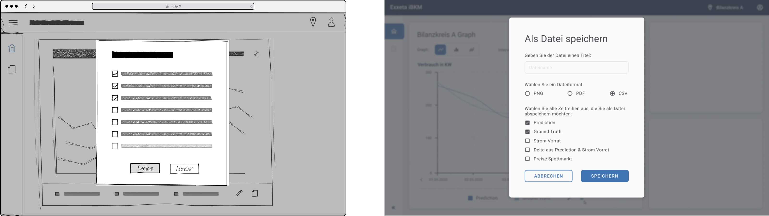
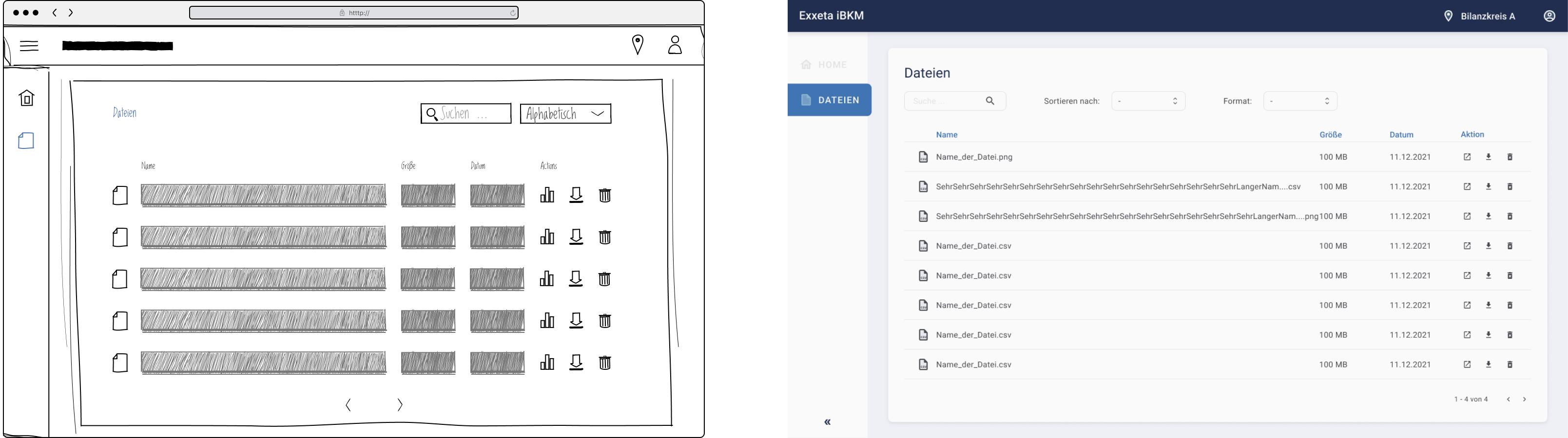
In the following are a few impressions:
Initial DashboardDashboardKey data selectionFile System
Check out our Figma project:
Development
Frontend
During the early stages of our project we decided to build our application on Reactjs using Typescript, since it helps to avoid runtime errors in our app that otherwise possibly would have come up using Javascript.
We also wanted to have a great performance, easy scalability and all in all high quality for the frontend.
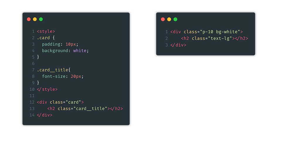
In reach that goal we decided to use Tailwind CSS (Just In Time Mode) and its utility first approach. While in traditional CSS it is common to build classes in which different properties define how a certain element behaves and looks,
using the utility first approach flips this idea and instead provides classes that hold one specific property. The component then can be styled by combining these classes.
Markup example before and after Utility First
Through the Utility First approach we were able to focus on building our components without having to take care of scaling our CSS or use specific methodologies like BEM.
When building the app the final CSS file only contains the classes that we actually used in our code which helps to avoid the need of loading a complete and huge CSS library and therefore guarantees fast rendering time in the browser.
Since we were already using Tailwind CSS we decided to use Headless UI for our UI components like dropdown menus, transitions, tabs, etc. The reason for this decision was to keep the frontend as independent and lightweight as possible as Headless UI only delivers unstyled UI components that then can be styled using Tailwind’s classes.
During the entire development process we made sure that everything we developed during a sprint would get a full technical/code and functional review to ensure that we only deliver quality, readable code that is easy to maintain and extended in the future.
We also implemented basic integration tests for our frontend using Cypress.
Backend
The backend was built using the Expressjs framework running on a Nodejs Server on AWS Lambda. The main task of the backend is to process and transform CSV files with raw forecast data which were generated by the KI-Model and stored on another S3 bucket. After processing, our backend provides the data in JSON format to our frontend using a HTTP endpoint.
In minimize resources and setup, as well as server costs, we built the project based on a serverless architecture using AWS Lambda functions. These only run when their HTTP endpoint gets called and only require a minimum of computing power. One Lambda Function on AWS usually only has one task, so whenever our application has to be extended in the future it is very easy to implement more functionality by adding more Lambda Functions.
Building the app this way, we avoid all fix costs for the project since there is no need for renting servers. The only (variable) cost centers are:
The storage that the prediction data and our React app require.
The Computing Power (RAM) that our Lambda functions require when they run.
Since machine learning predictions are usually difficult to understand, we used explainable AI in our project context to make the prediction plausible. The balancing group manager should be able to justify his decision-making to his superiors at any time by basing his purchase decision on the various influencing factors presented in the UI. This way, the user is able to check experiences and intuitions against the influencing factors and add more weight to the validity of his purchase decision. To enable explainable AI, it was necessary to analyze the existing machine learning model responsible for prediction using a framework. For this purpose we used the Python framework LIME. This allowed us to describe which input features of a model had contributed to the prediction and to what extent. We then had to standardize the explanations of the input features to the scale from 0 to 1. Furthermore, it was necessary to logically cluster the input features for our use case and to sum up the contributions of the individual features to the clusters.
Challenges
At the start of the project, we were brimming with ideas, but due to time constraints, we had to limit ourselves to the most important features. With the help of the initially conducted user interview, we were able to map a complete working user flow within our MVP. Eventually, we were able to validate these ideas in a user test.
When building our frontend using Tailwind CSS we wanted to stick as close as possible to the Utility First approach. Unfortunately we encountered some edge cases that required us to write classic CSS for example when animating our basic components like our input text field or when implementing focus, active and hover states for our elements.
Furthermore the entire concept of serverless software architecture was new to us, so we had to invest a good amount of time in research before we were able to start developing. Creating an AWS account to test the technology was a challenge, as this had to be done in several steps with verification directly through Amazon. In the end, we have the following new technologies in hand: AWS services including Lambda function, s3 bucket, serverless framework to deploy the function.