In the past few months, our project has gone through various phases, and they could be roughly divided into the following segments:
- Kicking off
- Preparation & Planning
- Database Structure & Website Blueprint
- Go Live!
- Booking System Prototyping
Kicking off
Preparation & Planning
Having learned about the needs of the business, we understood that this project could become a real product that’s being used by real users, meaning it has a heavier impact and higher stack. With that in mind, we wanted to understand the product and its target users together with the start-up company we were working with, so that there we were on the same page and knew exactly what we were building and who we were building it for. And in order to have a good understanding of whom the target users are, we started out by conducting user researches into user personas, user stories, and use cases.

Database Structure & Website Blueprint
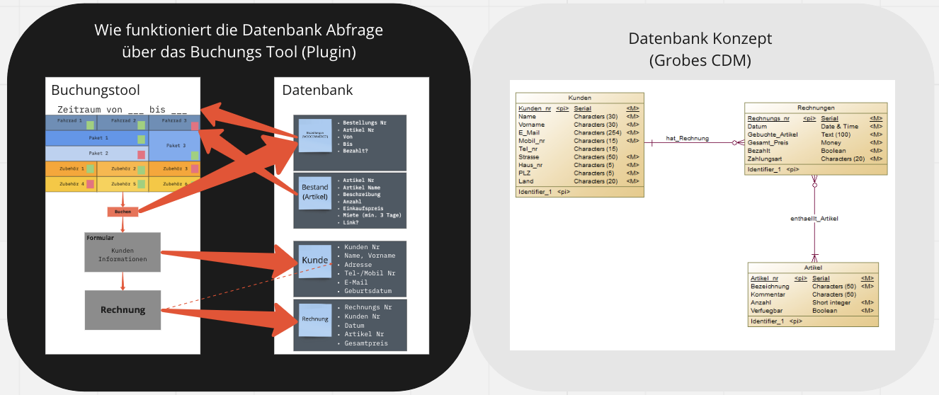
Now that we had a more concrete image of what the site should do, an e-commerce site for users to select a tour date and its corresponding available items to rent, so we must be clear of how the data should be structured and related to make it easier for our site to interact with the database:

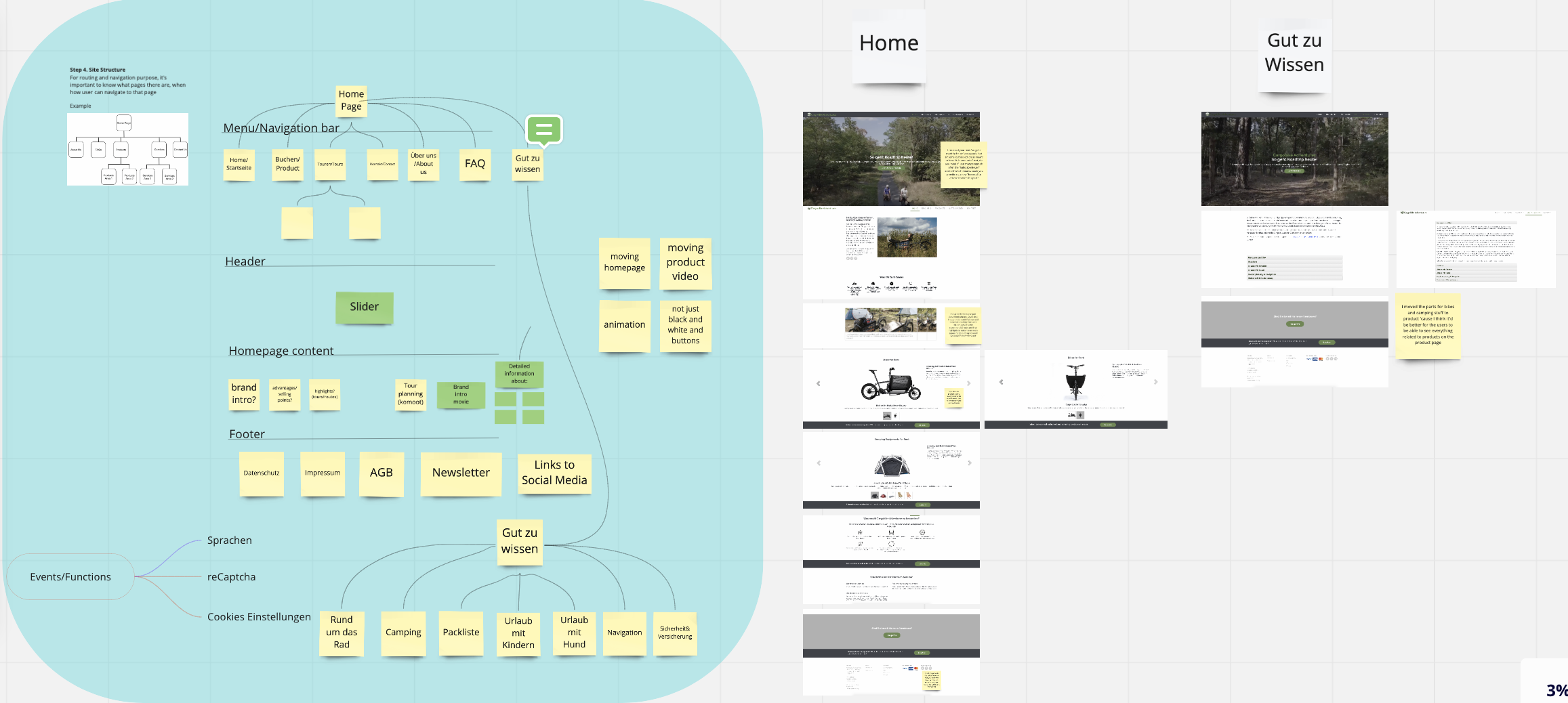
In addition to designing the database structure, we also started on the website blueprint to understand the most intuitive and functional way to users to navigate the site. And once we had a concrete idea of what pages were needed and their hierarchy, we applied our findings in user research and built a mock-up for the site:

Go Live!
Booking System Prototyping
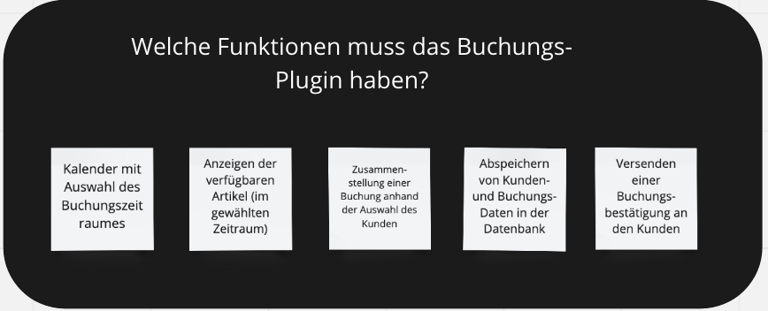
After going live and making sure the orders were going through and functioning appropriately. We went back to prototyping our booking system that allows users to select when their tours will be and what add-on gears they need to rent.
